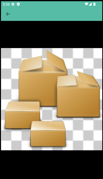
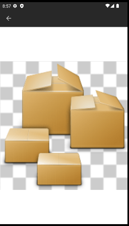
Checkerboard background for transparency in zoomed images #92

Merged
AmineB merged 4 commits from davidoskky/ReaderForSelfoss-multiplatform:checkerboard into master 2022-11-11 19:29:43 +00:00
Contributor

Types of changes

  • I have read the CONTRIBUTING document.
  • My code follows the code style of this project.
  • I have updated the documentation accordingly.
  • I have added tests to cover my changes.
  • All new and existing tests passed.
  • This is NOT translation related.

This closes issue #12

A checkerboard background is added to each image in the image view, so that when you load an image with a transparent background it's easier to visualize.
I may add this to images in the articles and feed icons as well if that is appreciated.

## Types of changes - [x] I have read the **CONTRIBUTING** document. - [x] My code follows the code style of this project. - [ ] I have updated the documentation accordingly. - [ ] I have added tests to cover my changes. - [x] All new and existing tests passed. - [x] This is **NOT** translation related. This closes issue #12 A checkerboard background is added to each image in the image view, so that when you load an image with a transparent background it's easier to visualize. I may add this to images in the articles and feed icons as well if that is appreciated.
Owner

It's weird to have the checkboard background only on the image.

When I was testing, I saw this image and thought it didn't work.
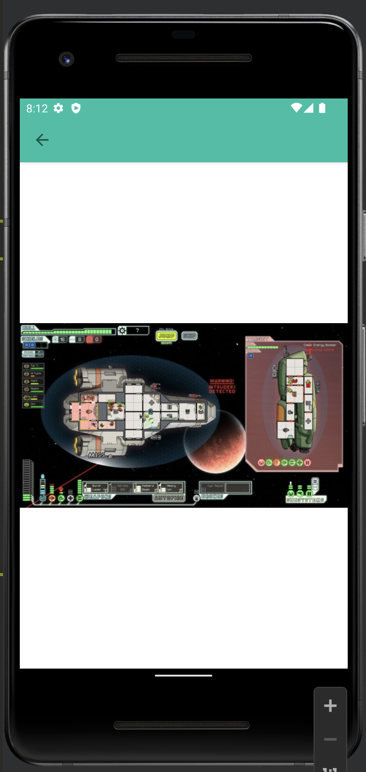
It would be better to have the checkboard as a background for the whole activity.

It's weird to have the checkboard background only on the image. When I was testing, I saw this ![image](/attachments/229468e7-89c3-4b8d-8fb8-fc0090114146) and thought it didn't work. It would be better to have the checkboard as a background for the whole activity.
Author
Contributor

That's actually quite easy to achieve. I did it this way because I felt it was unesthetic to have the whole screen checkered when that was unnecessary.
I hope this feature will be useful only rarely and thus I would prefer the checkerboard to appear sparingly to users without distracting when that's not necessary.
Moreover, this can be applied to the images within the articles as well and to the sources icons while setting the whole screen to a checkerboard can only be used in this screen.

If you prefer, I can set the whole screen to a checkerboard; but I feel this provides a cleaner interface which is also easier to the eye.
In general the user shouldn't be testing if a particular feature works all the time, it should just work when it's needed.

That's actually quite easy to achieve. I did it this way because I felt it was unesthetic to have the whole screen checkered when that was unnecessary. I hope this feature will be useful only rarely and thus I would prefer the checkerboard to appear sparingly to users without distracting when that's not necessary. Moreover, this can be applied to the images within the articles as well and to the sources icons while setting the whole screen to a checkerboard can only be used in this screen. If you prefer, I can set the whole screen to a checkerboard; but I feel this provides a cleaner interface which is also easier to the eye. In general the user shouldn't be testing if a particular feature works all the time, it should just work when it's needed.
Owner

I did it this way because I felt it was unesthetic to have the whole screen checkered when that was unnecessary.

Do you have a screenshot of the result with the whole screen checkered ? Because the screenshot I posted are unesthetic too.

Moreover, this can be applied to the images within the articles as well and to the sources icons

Is there anything preventing us from doing both ?

If you prefer, I can set the whole screen to a checkerboard; but I feel this provides a cleaner interface which is also easier to the eye.

I don't think that the white and checkered background is easy on the eye either.

In general the user shouldn't be testing if a particular feature works all the time, it should just work when it's needed.

So, is there a way to test if the image have a light background (in light mode) or a dark background (in dark mode) ? That way, we would only change the background when needed.

> I did it this way because I felt it was unesthetic to have the whole screen checkered when that was unnecessary. Do you have a screenshot of the result with the whole screen checkered ? Because the screenshot I posted are unesthetic too. > Moreover, this can be applied to the images within the articles as well and to the sources icons Is there anything preventing us from doing both ? > If you prefer, I can set the whole screen to a checkerboard; but I feel this provides a cleaner interface which is also easier to the eye. I don't think that the white and checkered background is easy on the eye either. > In general the user shouldn't be testing if a particular feature works all the time, it should just work when it's needed. So, is there a way to test if the image have a light background (in light mode) or a dark background (in dark mode) ? That way, we would only change the background when needed.
Author
Contributor

Here is a screenshot with the full screen.

Is there anything preventing us from doing both ?

No, not really.

I don't think that the white and checkered background is easy on the eye either.

The background was previously black, maybe that would be better.

So, is there a way to test if the image have a light background (in light mode) or a dark background (in dark mode) ? That way, we would only change the background when needed.

I think doing something like that would be quite difficult. I have found no libraries doing that and maintaining such feature would become a huge hassle since I can imagine a lot of problems and hedge cases arising.

Here is a screenshot with the full screen. > Is there anything preventing us from doing both ? No, not really. > I don't think that the white and checkered background is easy on the eye either. The background was previously black, maybe that would be better. > So, is there a way to test if the image have a light background (in light mode) or a dark background (in dark mode) ? That way, we would only change the background when needed. I think doing something like that would be quite difficult. I have found no libraries doing that and maintaining such feature would become a huge hassle since I can imagine a lot of problems and hedge cases arising.
Owner

I the screenshot whith the whole screen checkered, the checkboard is smaller than the other screenshots, and the image is very low quality, so I don't find this version better than the other.

I just tested a little bit, and found that setting android:background="?attr/colorOnBackground" to the Photoview works pretty well.

(In light mode)
image

(In dark mode)
image

I the screenshot whith the whole screen checkered, the checkboard is smaller than the other screenshots, and the image is very low quality, so I don't find this version better than the other. I just tested a little bit, and found that setting `android:background="?attr/colorOnBackground"` to the `Photoview` works pretty well. (In light mode) ![image](/attachments/b747c535-735e-40f9-b93e-b84a2b2bed7f) (In dark mode) ![image](/attachments/732e28fd-1974-4ece-9d93-2e1c8f8bd91a)
124 KiB
124 KiB
Author
Contributor

You mean to set the background color? Yes, I have to insert that in so that the color changes according to the theme.
Here is a screenshot with the fullscreen background and the same image as the first one.

The advantage seems to be that the background does not change when you zoom in, while it gets zoomed does when you set it as the image background.

You mean to set the background color? Yes, I have to insert that in so that the color changes according to the theme. Here is a screenshot with the fullscreen background and the same image as the first one. The advantage seems to be that the background does not change when you zoom in, while it gets zoomed does when you set it as the image background.
Owner

The advantage seems to be that the background does not change when you zoom in

This should always be the case.

In all the screenshots here, the ones I prefer the most are the one in my previous comment.

> The advantage seems to be that the background does not change when you zoom in This should always be the case. In all the screenshots here, the ones I prefer the most are the one in my previous comment.
davidoskky force-pushed checkerboard from ae0909ef0a to c09a32e9ad 2022-11-09 16:04:08 +00:00 Compare
Author
Contributor

I added the background and this now produces views such as the ones you sent in your screenshots.
The main problem with this implementation is that the checkerboard background is static and gets zoomed in when you zoom in; thus the squares become larger when you zoom in.

I found no way to keep the checkered background just behind the image without it being zoomed with the image.
I can alternatively set the checkerboard to cover the whole background; this will also appear with images without any transparency.

I added the background and this now produces views such as the ones you sent in your screenshots. The main problem with this implementation is that the checkerboard background is static and gets zoomed in when you zoom in; thus the squares become larger when you zoom in. I found no way to keep the checkered background just behind the image without it being zoomed with the image. I can alternatively set the checkerboard to cover the whole background; this will also appear with images without any transparency.
Owner

Here is my proposition.

Here is my [proposition](https://gitea.amine-louveau.fr/Louvorg/ReaderForSelfoss-multiplatform/commit/3a3bf0311499136133d7f482b572d85f4314af9a).
davidoskky added 2 commits 2022-11-11 08:40:56 +00:00
Bigger checktile.
All checks were successful
continuous-integration/drone/push Build is passing
3a3bf03114
Revert imageview changes
All checks were successful
continuous-integration/drone/pr Build is passing
dbe97f564e
Author
Contributor

Looks good to me; you may merge this.

Looks good to me; you may merge this.
AmineB merged commit 537a6d3a0b into master 2022-11-11 19:29:43 +00:00
davidoskky deleted branch checkerboard 2022-11-13 12:56:09 +00:00
Sign in to join this conversation.
No reviewers
No Milestone
No project
No Assignees
2 Participants
Notifications
Due Date
The due date is invalid or out of range. Please use the format 'yyyy-mm-dd'.

No due date set.

Dependencies

No dependencies set.

Reference: Louvorg/ReaderForSelfoss-multiplatform#92
No description provided.